Saturday, October 21, 2023

Learning: Graphic design fundamentals shared on the Create & Thrive Podcast with Jess Van Den

Earlier this year, I recorded Graphic Design fundamentals for the Create & Thrive Podcast with Jess Van Den who happens to live on the Sunshine Coast, Australia. It was very exciting to record this episode due to her obvious handmade business savvy, creativity, and talent she brings as an entrepreneur and artist from the land down under. I am, of course, located in Southern New Jersey in the U.S., so our separation and differences included oceans, accents, and even centimeters vs. inches.

It was a great experience to share some of my 20 years of graphic design knowledge with her listeners, and I would like to point you in the direction of her excellent podcast both for this and other episodes. Her Etsy business, called Epheriell, is where Jess Van Den handcrafts beautiful and stylish jewelry, and her Create & Thrive business is where she helps others grow and prosper with their own handmade businesses.

Follow the provided link to hear our interview.

https://www.createandthrive.com/graphic-design-fundamentals-for-makers-with-ron-miller-289

Podcast clarification points:

After listening to the finished podcast, I decided that certain points made regarding design principles and other items could benefit from additional clarification.

Time stamp / Details

16:24 / domain registrar

I use Hover.com to register a number of website domains. For our business blog, we have registered www.trishaswares.com.

24:19 / Fonts vs. Typeface

Typeface: Helvetica - a san-serif typeface used commonly for text (similar to Arial)

Font: Helvetica Condensed Bold 9 point - a specific weight, style, or size of the Helvetica typeface


25:30 Mixing typefaces (consider the contrast between competing typefaces)


25:46 Logo creation for different formats, sizes, and colors


33:35 Vector vs. Bitmap

Bitmap images are made up of a series of pixels (making them ideal for photos and smooth transitions of tone and color).

Vector images are software-created and based on mathematical calculations (making them ideal for simple, clean-cut lines and shapes as well as perfect scaling to any size).


43:12 Character Spacing


Note: TYPEFACES of the same point size can appear very different in size
due to the nature of their individual font characters. For example, both
TYPEFACES used (Countryside & Clearface Gothic) are 80-point type.
The Countryside FONT does not contain any lower-case characters. 


Friday, November 11, 2022

Craft Fair 101: attending our very first Craft Fair

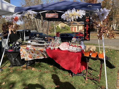
On Saturday, November 5th, Trish and I attended Hillary’s Handmade Craft Fair in Turnersville, NJ. This was our maiden experience bringing our products directly to the consumer (compared to selling online in our Etsy shop). There were about 25+ vendors in attendance displaying a variety of products ranging from jewelry, candles, baked goods, knitting, wreathes, and even doggie treats. My favorite was the Sweet Dill pickles I'm now enjoying–homemade from Lena Mills Naturals. Trish and I had previous experience at vendor events where we simply passed out descriptive information. This time, however, we needed to have systems in place for taking payment both in cash and credit/debit since we were now selling our "wares." We used a metal cash box, and we also implemented a POS system (Square) for accepting card payments. The use of a cell phone hotspot was also a requirement for wifi access.

Knowing the many details required in setting up a vendor table, we used a free online software (as we had in the past) named Trello for organizing lists of items to bring and prepare. These included all the basics for a vendor booth such as canopy, canopy weights, folding table(s), tablecloth, chairs, cooler chest for snacks and drinks, zip ties, various tapes, utility knife and scissors, and several other basic tools. 

A somewhat breezy but beautiful Fall day in Turnersville, NJ 
at Hillary's Handmade Craft Fair

We also packed and displayed a variety of our shelf or wall decor. Included in the mix were: holiday sconces, reindeer food bottles, a Santa milk and cookie platter, and holiday flower pots. Fall additions included pumpkin pencil holders, pumpkin spice blackboard sign, and an additional array of marked-down Halloween items. General signs and plaques relating to the themes of coffee and family were also for sale. 

For our very first craft fair, we felt the display was adequate and showed off our creativity and production quality. Sales were slow, but we had very little in the way of expectations.  We more than covered the cost of our table fee, but the effort to set up, spend 5 hours, and then break down and transport were not conducive to an overall respectable hourly rate. So in my mind, we lost money.

I mentioned this was our first craft fair. The question is whether it is our last. Parts of this process are appealing. We love the Fall with the changing leaves bursts of color, chill in the air, and the mindset of people looking for a special gift as the holidays approach. We also had some great conversations with other vendors, and I for one love to hear what brought them to being a craft vendor.

But, online orders that appear on my home computer, while I drink my hot coffee, seem more appealing with a lot less work. So it stands to be decided as to where we go from here.

Wednesday, March 16, 2022

Learning: what is a slip sheet, and when is it helpful?

Transferring vinyl lettering and graphics to any surface has its challenges. Transferring vinyl on top of vinyl, layering if you will, is an entirely different issue. Usually, one can cut their lettering or graphics, weed them, pick them up with transfer film, and carefully lay them down on a surface that will only partially grab the adhesive from the vinyl during the positioning stage. But when the adhesive side of vinyl touches the smooth side of other vinyl, let's just say it's like the wedding vow "what God has joined together let no man set asunder." It grabs with all its might.

Therefore, a slip sheet is needed that only allows a small part of the vinyl, that's to be transferred, to touch the surface of where it will eventually rest. The slip sheet should have a slick surface, so I save vinyl backing paper just for this purpose. It is also nice to have some handles out to the side of what is being transferred so that some centering and aligning can be manipulated from outside of the live area. Therefore, make sure the slip sheet is, left to right, much wider than your transfer area.

Usually, this opaque piece of vinyl backing is just the answer. But one occasion, there are special projects that need closer attention to detail. Case in point, the Easter message I needed to place on a wooden egg was designed to have color text layered on top of a larger white border. This would essentially give the visual impression of a thicker white outline around the type. When I used the opaque slip sheet, I could not see the lettering top to bottom. Since I was centering the color text onto a while outline and attempting to maintain a consistent border, I really needed to see the entire letter. After some quick thought, I wondered how plain old wax paper might work since it has a shiny, slippery side and it is at least translucent. Surprise! It works like a charm. 

Note: a word of caution here. Make sure you have the slippery side up for the vinyl adhesive to rest upon. Secondly, I found that repeated uses of the same paper must remove some of the wax and therefore allow the vinyl to begin to stick to it. Since wax paper is such a common household item, and it is quite inexpensive, rip away and use as much as you want.


Shown using the opaque slip sheet method (vinyl backing piece)

Shown using the wax paper method allowing for
better clarity of items below transfer film


Sunday, March 6, 2022

Special Projects: Harry Potter & Dementor float

You're a wizard Harry! Yes, this is my grandson flying high above Hogwarts castle with a nasty Dementor giving chase. Everything pictured (excluding costume & castle) was created with magic. Expecto Halloweenus! This rolling float was an eyecatcher, and Jayden's performance as Harry really made it all work brilliantly.


Worked on the Dementor inside my backyard gazebo since it
required messy liquid starch and spray paint.

Early stages of the rolling platform foundation.
The additional challenge was to build it to come apart and
fit inside the bed of my 5-door car.
The black rods at the base are plastic tubes, and broom
assembly is inserted and pinned in place.
Built to take the weight of a 5-year-old.

Wednesday, February 23, 2022

Tips & Tricks: Custom grid overlays to assist in easier alignment and replication

Lining up type and graphics on projects is always a challenge. Whether it is vinyl cut on a Cricut® or Silhouette® machine, or a stencil for painting, things need to be straight and square. Some handmade artists are blessed with an incredible eye for placement, spacing, and alignment. But even the best subjective eye cannot match the reference of an objective measurement. Therefore, rulers are of course helpful. I use transparent rulers, sometimes with a strip of white vinyl just under the numbers, to get things accurate. Center finder rulers are also helpful as they have a zero point in the middle and measure in both directions simultaneously. 

In addition to these methods, however, is the use of a transparent grid overlay. If you are using vinyl with transfer tape that includes a grid, that can be helpful. Myself, I prefer grid-less transfer tape so that I can use a custom grid most useful to my project. And where do these grids come from? Well, I make them.

Inkjet printers can print on a marvelous array of materials. There is a material called Transparency Film for Inkjet Printers. I purchased it in a lot of 30 Sheets, 100% Clear,  and 8.5 x 11 inches in size. Be aware that there is a Print side and a Non-Print side. Using a vector graphic program (could be Illustrator, InkScape, etc) I created the size of the grid blocks I needed across the full size of the 8.5 x 11 canvas size. I used .25" blocks, and I added a light grey strip behind every other row of blocks, vertically and horizontally, to differentiate between the columns. Also, I added a bolder center line both vertically and horizontally for reference. I duplicated this file and switched the light grey strips to the horizontal. Everything else remained the same. Now I have two grids that can be overlayed, with a strip of tape typically at the top, on projects. Just line up the horizontal or vertical boundaries from the physical project and lay your type and graphics underneath until aligned with the grid.

Note: be sure to only allow a small amount of your transfer tape (used to move the vinyl to the project) to touch your project while lining up the type and graphics. This can be done by using some excess vinyl backing paper (the shiny side) stuck to the bulk of your transfer tape. Once the alignment looks right, rub-down the top of the transfer tape and slowly remove the shiny backing paper until all the transfer tape is on your project. Remove your grid, and burnish your vinyl as usual. Job done!

One more thing: accurate measurement is a key to success, but there are visual anomalies dealing with eyesight that one should be made aware of. Always go with what "looks" best regardless of the measurement. For example, you wouldn't buy a size 8.5 sneaker, even if this "should" be your size, when a 9 feels much better. When all is said and done, use common sense and pay attention to overall appearance-that is what your customer is seeing.


Both horizontal and vertical column grids are helpful
since projects come in all shapes and sizes.
Tape them together to make larger grid overlays.

Wednesday, January 12, 2022

The category of goods we actually sell, and how we will move forward in 2022

Happy New Year everyone! We hope you had pleasant holidays and feel refreshed to begin a new and exciting year ahead.

As Trish and I reflected back on 2021, we considered what kind of work we actually would find most fruitful and rewarding in the new year. Being a new handmade business with little to no footprint, it is easier to pivot and adjust our branding without confusing our audience. Actually, since there is no real audience yet to confuse, we are grateful if you took the time to read about our soul-searching adventure.

Our initial branding was as follows: Trisha's Wares: Creativity, Passion, Craft. Although this seemed a bit ambiguous if not true to our values, it was by design a bit generic. We really didn't know what direction or pathway to follow. All the online advice says to find your niche and stick to it. Diversification is apparently not a great asset in a handmade business. But we felt it was not so much about the actual products we create as much as it was about the category we felt comfortable being known for. What did we actually sell, what was its purpose, who would purchase it, and does it match our skill sets and heartfelt interests?

It became clear that we created and sold Home Decor. Our items are for your living space, and these products will either sit on a shelf or table, or they will hang on a wall. We are interested in the topics of family, faithfulness, children, grandparents, and holidays. We have a special interest in Christmas, Halloween, Fall/harvest creations, and that "country" feel. I, myself, have specific passions for coffee and tennis. I love to work on the computer with typography (as a former professional graphic designer), and signs of various types and styles are of special interest. Trish is more excited about the assembly of various 3-dimensional elements that combine color, shape, texture, and theme. But at the end of the day, we are really about Home Decor in whatever shape, size, or form that inspires us. Therefore, we have added the verbiage of "Home Decor" to our brand. We hope this will help customers better find us, and we will use it as our compass in pursuing genuine projects reflecting who we are as individuals in 2022.


Friday, August 20, 2021

Tips & Tricks: grey vs. black color assignment in Cricut Design Space

It’s a very common practice to import black text or graphic .svg files into Cricut Design Space. But when placing them into the screen mat mockup, the software places your black images onto a black mat. In order to fully use your vinyl material, you need to pay close attention to positioning your image on this screen. But for me, black on black only works in fashion and not when aligning vinyl. Therefore, before clicking “Make It” in Cricut Design Space, assign the image another color. Although I have not tried the entire palette, any level of grey seems to work fine. It will then place a darker grey image onto a lighter grey background. This makes positioning the images much easier to see and allows for greater precision. This should be automatic as I have not had this problem with any other color. But perhaps they will adjust this in a future update. Until then, this trick really helps.